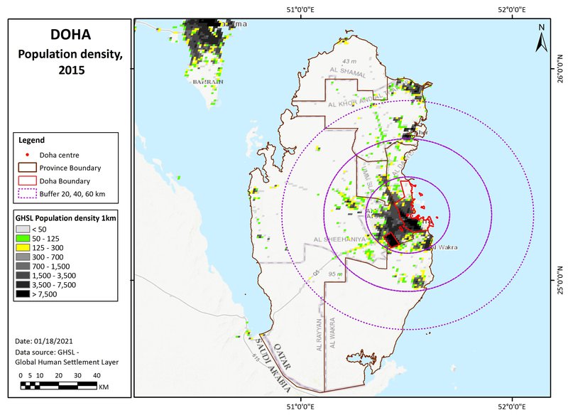
Doha region: location
Doha region
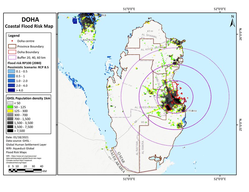
(The map here shows circles of 20, 40 & 60km radius, a rough approximation to the gravity field).
Doha region: overview
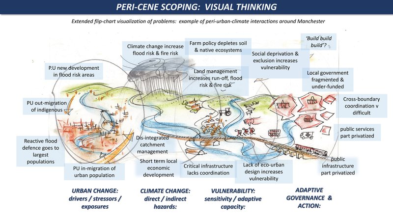
Peri-urban-climate scoping
Using visual thinking for the deeper complexity of peri-urban-climate interactions, here are 2 images. The first is a flip-chart sketch and overview of the problem. The second is a ‘Causal mapping’ from the Peri-cene Framework, with basic problems and pathways. For more see the Doha pathways:
(In advance of consultation this is a general version with typical problems and pathways around the world).
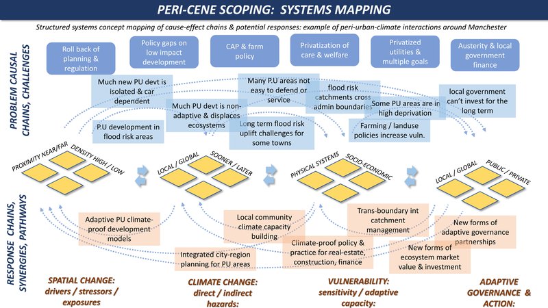
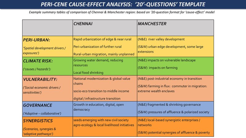
Causal analysis
This puts the mapping above into analytic form with a summary table. For more see the Doha analysis:
(In advance of consultation this version is a comparison of our 2 detailed case studies)
Climate hazard
(World Bank data profile for Qatar)
Extreme heat - High
Wildfire - Very low
Water scarcity - High
River flood - Low
Urban flood - Low
Coastal flood - High
Cyclone - Very low
Tsunami - Low
Landslide - Very low
Earthquake - Very low
Volcano - No data
Spatial mapping
The Peri-cene takes a practical approach to the complexity of peri-urban-climate interactions. The base-maps here build on the JRC-GHSL (Global Human Settlements Layer) system of urban mapping with 1 km2 cells http://ghsl.jrc.ec.europa.eu . In this way the peri-urban definition and mapping is not a final answer, but the start of the discussion. For more on the questions of 'where is the peri-urban?' and 'how is it changing?' download the D3-1 report.
Population density map
This shows three population density bands: 0-50, 50-125, and 125-300 persons/km2: (transparent for open land, and then green and yellow cells). These are in different proximities to the main urban centres, for the moment defined by distances (from the urban centre), of 0-20, 20-40, and 40-60km: titled 'near-urban', 'near-urban: further urban: and ex-urban / peri-rural'.
Population change
Content coming soon.
Climate projections: coastal flooding
Including sea level rise, tidal, and storm surge effects, this is a 'reasonable worst case scenario' for 2080, with reduced policy and pessimistic modelling. This is based on the mapping from www.climate-central.org
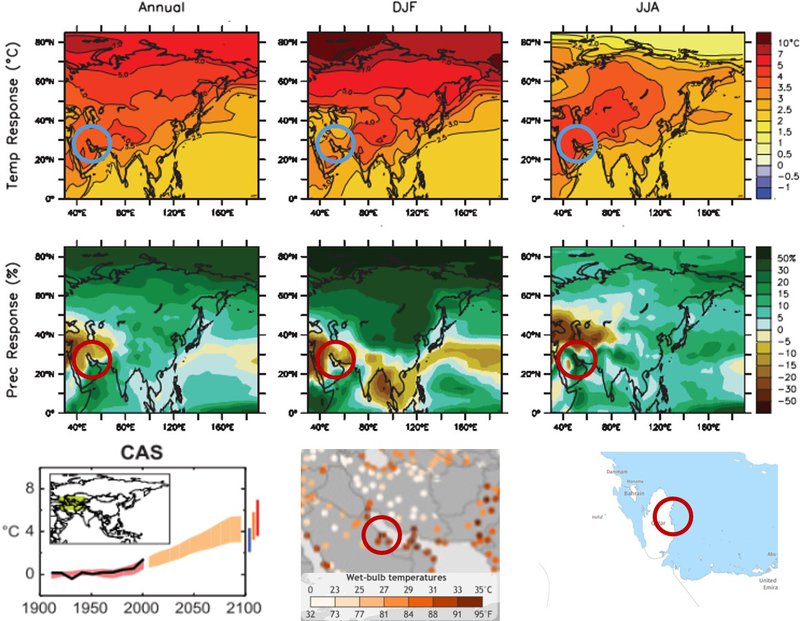
Climate projections: temperature effects
Top six images show annual, summer, and winter temperature, and precipitation changes. Bottom left shows projected temperature changes for a range of scenarios by 2100. Centre bottom shows daily temperature events within the top 0.1% recorded local temperatures from 1979 to 2017. Bottom right shows the 2010 forest cover.
Sources:
IPCC-WG1 2016
NOAA
Global Forest Watch